
Case study
Faster stops. Smoother flows.
We designed key screens and visuals for a streamlined Shell app — prioritizing clarity, speed, and on‑the‑go usability.
- Role: UI/UX, Visual Design
- Timeline: 2 weeks
- Deliverables: App Screens, Assets
Designing for real‑world use
From payment to rewards to station discovery, the experience concentrates on the few actions people use most and makes them effortless in the moments that matter. The flow is opinionated—find a station, confirm a pump, pay securely, and earn points automatically—so you move forward without second‑guessing. Clear hierarchy, high contrast, and generous tap targets keep everything legible at a glance, even in bright daylight or one‑handed in the car. Language is concise and consistent; labels use verbs, error states are human, and feedback appears exactly when needed. We also optimized for speed: lightweight screens, cached locations, and progressive loading mean core tasks respond quickly on any connection. Privacy and trust are built in with transparent permissions, recognizable payment patterns, and clear progress so the app always feels reliable and in control.
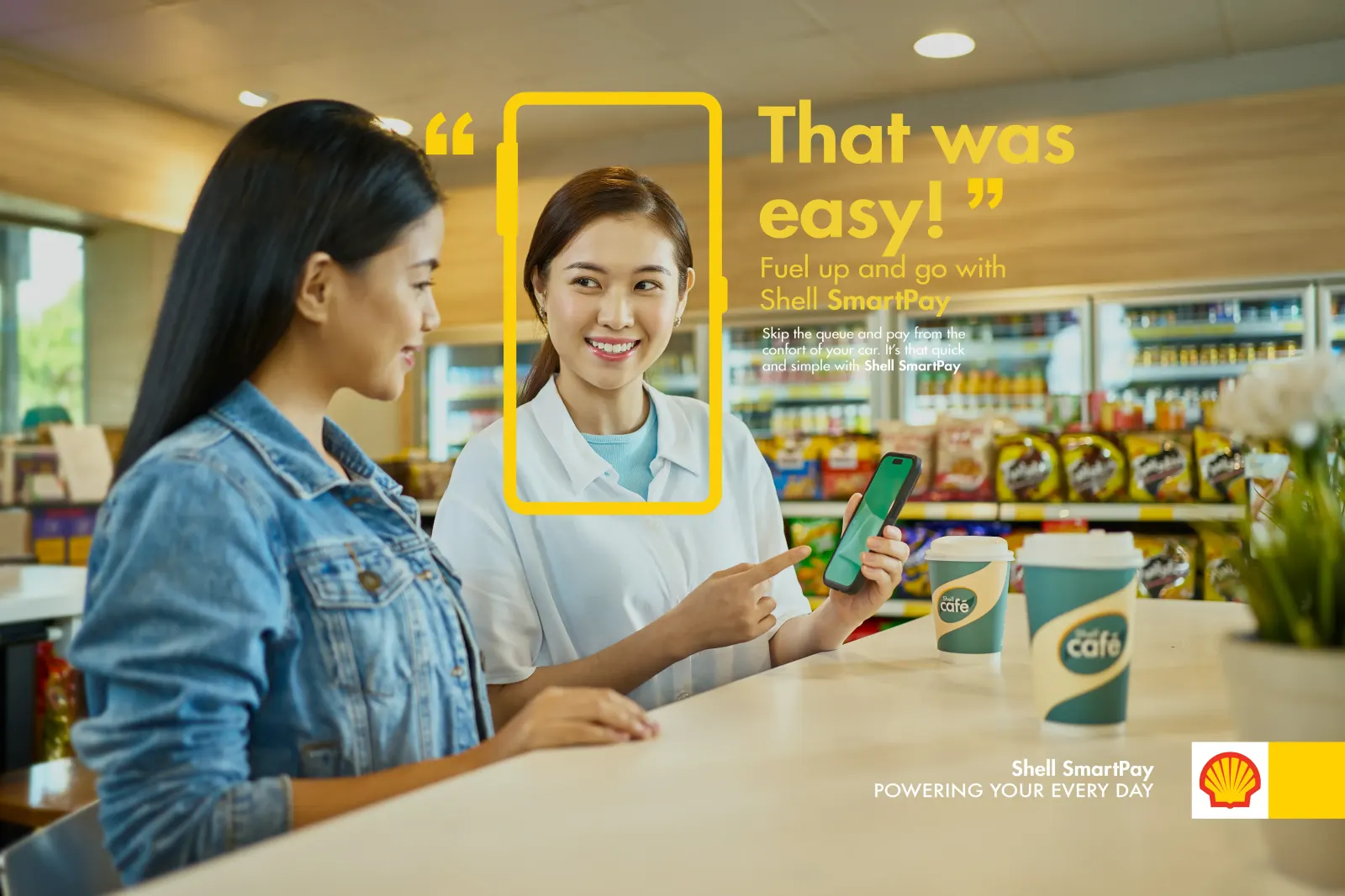
To support the design, we produced a visual system and photo set that tell the same story of clarity and momentum. Pre‑production began with a shot list and brand moodboards to define color, contrast, and framing. On set, we staged real‑world scenarios—at the pump and in‑car—to reflect how the app is actually used. We controlled glare and highlights with flags and polarizers, matched device brightness to ambient light, and captured multiple exposure passes for clean screens. In post, we color‑managed to Shell’s palette, retouched reflections and edges, and composited final screens onto calibrated device frames to keep typography razor sharp. The result is a cohesive toolkit—clean type, confident color, and purposeful spacing—paired with authentic imagery that feels unmistakably Shell and scans instantly across web, social, and presentation formats.
Interface
5Shell App — Pay, Earn, and Find Faster
Pay at the pump, collect rewards, and locate stations in one clean flow that feels effortless from the second you open the app. We designed the experience around the realities of the road — quick glances, bright daylight, and one‑handed use. Clear hierarchy and an opinionated layout guide you through the core journey without friction: choose a station, confirm the pump, pay securely, and get on your way. Rewards are built into the flow, not hidden behind menus, so earning and redeeming points happens naturally as part of each visit. Strong brand cues and consistent patterns create familiarity across screens, while performance optimizations and lightweight visuals keep interactions snappy on any device.
Accessibility and confidence are central. Large tap targets, high‑contrast color, and motion used with restraint make actions obvious and easy to hit the first time, even under sun glare. Typography is tuned for legibility at a glance, and spacing is generous so every control is distinguishable, whether you’re in the driver’s seat or at the pump. We simplified decision points to reduce cognitive load: fewer steps, clearer language, and progressive disclosure when details matter. Helpful prompts appear at the right moment — not before, not after — so you always know what’s next. Combined with secure payments, transparent feedback, and a clear sense of progress, the result is a refueling companion that feels reliable, fast, and unmistakably Shell.
More from this project
10Have an app to refine? Let’s make it effortless.
 Next projectSuria & SonneElegant design solutions for a modern lifestyle brand.